I spent the weekend doing almost nothing but reading. My husband teased me about my impending bedsores, even. It’s been amazingly luxurious, but also somewhat frustrating, thanks to some recent changes that iBooks has made, lately.
Firstly, though, let me start on a note of appreciation. Thank you, thank you, thank you for dark-mode in the bookshelf view. It is a gift and a joy for insomnia sufferers who run out of book, as too often happens to me. Thank you also for environment-aware darkness settings, I had missed the cream backgrounds in brighter lights.
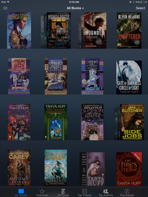
However, Apple, I have a few bones to pick with the ways you have changed interactions with the bookshelf view I your app. Let me start with a screenshot:

(Feel free to lambaste my taste in reading, these things happen.)
First of all, you have begun to reorder my books without my permission, pushing the last-opened book to the top, without any obvious way to prevent it. Before the latest version I could, and sometimes did, rearrange my books. I used it to arrange series’ in order, mostly. Aside: I am aware of the “collections” feature and use it somewhat, but it’s not a replacement for having my books be in a predictable and consistent position. I can see where some users might approve of this behavior, but if I’m reading a series I have read before, I have to dredge each installment of the story from the depths of my bookshelves separately, rather than returning there automatically, each book grouped with its series.
Secondly, what is up with your “series grouping” behavior? I would love for this feature to be more robust, but right now it’s inconsistent and frustrating. Books I know belong to a series are displayed independently (see the Arrows series on the second row and the Keepers series on the next shelf down), some titles sadly looking in from outside (see Shattered looking wistfully at it’s brothers Hounded and co), some books seem to think they’re a series of one (this may have to do with being a sample?), and again, there’s no way to influence it directly. Don’t you trust me to know best, Apple, about whether the books I’ve read go together?

(It looked good in the store, I just never found the interest.)
Look. These are little things, really. The thing is, though, that they combine to make me feel less in control. I used to be able to pick a book up and put it somewhere. Now I struggle against a system intent on fighting me. “No, you read THIS one last, it’s the one that deserves upper-left billing, not a place of pride next to all the rest of the books you bought during that feminist essay binge.” it says. “I know better than you”. The keywords that my User Experience co-worker uses to talk about what a piece of software interaction should do for you are deference, clarity, and depth. It seems like re-arranging your books from the way you’ve sorted is not deferring to the user’s wishes, it’s imposing their will upon them instead. It is not clear that books that were grouped when they were opened should be in different locations when you close them again. Depth doesn’t really seem to apply, either.
This “most recently opened, first” paradigm is something that makes sense when doing more computer-oriented tasks like file-editing where you’re often coming back to the same files over and over, more than analog tasks like shelving, selecting, and reading books. It’s a case of developers trying to move away from the now dead-to-us philosophy of skeuomorphism, and going too far to the other side, I think. Books aren’t like word-processing documents. I don’t open and close one often while proceeding through a project, and then never come near it again. I open it once, read it in it’s entirety, close it once, and then leave it be for awhile until my heart calls for that particular kind of comfort, again.
…I wonder if Apple will accept a blog post as a radar… :)
PS: I suspect I could go edit some metadata, perhaps in iTunes, to resolve the series-containment problems. Thing is, I shouldn’t have to. my iPad is made to be a self-contained device, not needing to be attached to a computer to be a full experience, and correcting faulty meta-data is tedious at best.